A rebrand very close to my heart.
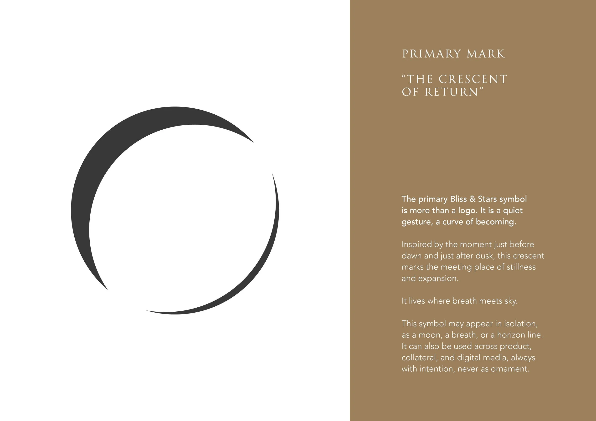
Bliss & Stars was never created to feel loud or performative. It was designed as a quiet return, a brand built around stillness, honesty and space to breathe. From the crescent mark inspired by the meeting of dusk and dawn to the grounded earth tones, textured typography and slow visual language, every detail was crafted to feel calm, intentional and held.
This project extended far beyond designing a logo. I developed a complete brand world, shaping the voice, visual identity, storytelling, social direction and digital presence around one guiding thought: “Pause. Breathe. Return.”
The intention was to create a brand that feels like an exhale in a world that constantly asks people to perform. Quiet, grounded and deeply human.